LINIO · LATAM · 2023
Driving customer engagement and product transparency

Role
UX Lead
Category
Ecommerce
Platform
Web, iOS, Android
Date
Jan - Jun 2023
About Linio
Linio is a leading e-commerce platform in Latin America, operating Chile, Colombia, Peru, Mexico, and Argentina
It offers a wide range of products—from electronics and appliances to fashion and home goods—through a marketplace model that connects buyers with local and international sellers. With millions of monthly visitors, Linio focuses on delivering a seamless online shopping experience tailored to the diverse needs of the region’s consumers.
Context
We found that although 85% of users considered reviews helpful in making a purchase decision, only 12% interacted with them, and just 7% read more than three
This was impacting conversion rates, especially in high-value categories such as appliances, technology, and premium fashion.
Main problem:
- Low visibility and accessibility of the reviews section.
- Limited trust generated by the way information was presented.
- Poor filtering and navigation experience.
Goal
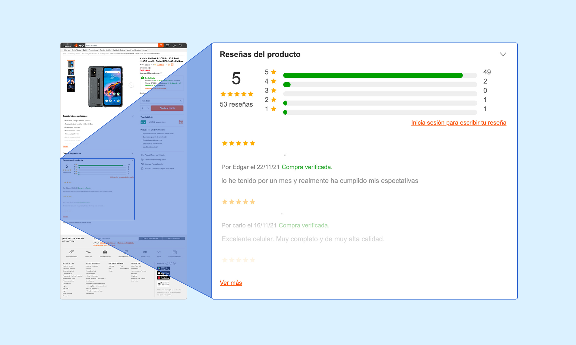
Our ambition was to transform the reviews section from a static, overlooked block of text into an engaging, trustworthy decision-making tool
We wanted users to see it not as “extra information” buried down the page, but as a core part of the product story—something that would help them visualize how the product performs in real life, through the voices of other customers. By making reviews easier to find, simpler to navigate, and more credible, our aim was to increase user confidence and, ultimately, drive measurable growth in conversions across Linio’s most strategic categories.
Toolkit
Design & Research toolkit
Figma

Maze
Optimal Workshop

Google Analytics

Google Optimize

CrazyEgg
The team
This project was a collaborative effort that brought together cross-functional expertise from multiple countries in Latin America
As UX Lead, I facilitated collaboration between disciplines, defined the design strategy, ensured consistency across markets, and maintained alignment between user needs and business goals.


Gabriel consistently pushed the team toward continuous product improvement and encouraged the ongoing growth of each team member, supporting every proposal. He is someone who manages projects and timelines effectively, bases his design decisions on metrics, aligns with business goals, and creates products that deliver value.

UX Designer @Linio
Process
We followed a user-centered, iterative approach to ensure the redesign addressed both user needs and business goals
- Research – Analyzed user behavior metrics, benchmarked competitors, and conducted quick interviews to identify pain points.
- Opportunity definition – Prioritized improvements such as better placement, enhanced filters, and trust-building visual cues.
- Design – Created wireframes and interactive prototypes, tested remotely with users, and refined based on feedback.
- Implementation – Collaborated with development to ensure high performance, accessibility, and seamless integration.
- Measurement – Tracked post-launch KPIs to validate impact and guide future enhancements.
Research
We began with a quantitative analysis of user behavior, reviewing scroll depth data and click metrics for the reviews section on the PDP.
The data confirmed that most users never reached the section, and those who did interacted very little with it.


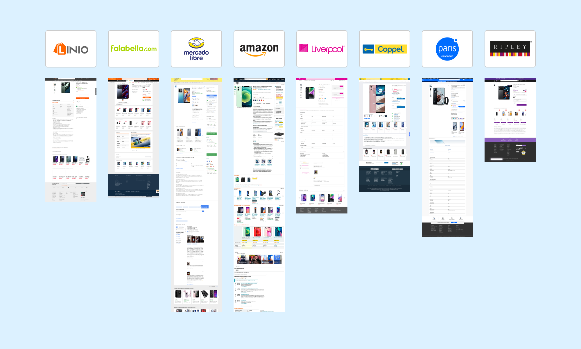
Next, we conducted a competitive benchmark
Analyzing how major e-commerce platforms such as Amazon, Mercado Libre, Falabella, and others presented and prioritized product reviews. This helped us identify patterns and best practices in layout, filtering, and trust-building elements.
To complement the data, we ran quick guerrilla interviews with 15 users from different countries and age groups
The goal was to observe how they searched for and consumed product reviews, and to uncover friction points in the current experience.


Defining opportunities
Our research revealed clear opportunities to make reviews more visible, increase user trust, and simplify navigation
By addressing these areas, we aimed not only to improve the user experience but also to drive higher engagement and boost product page conversion:

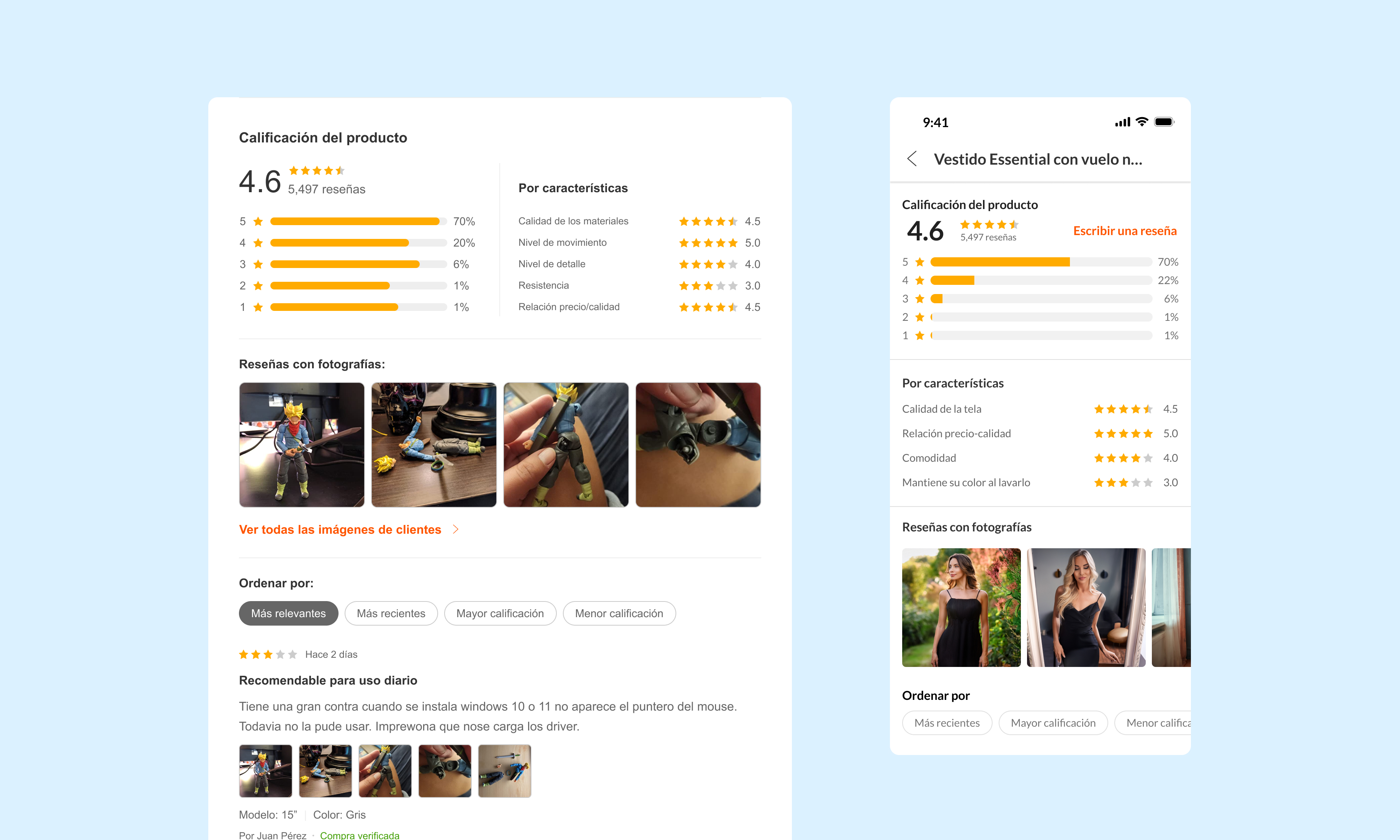
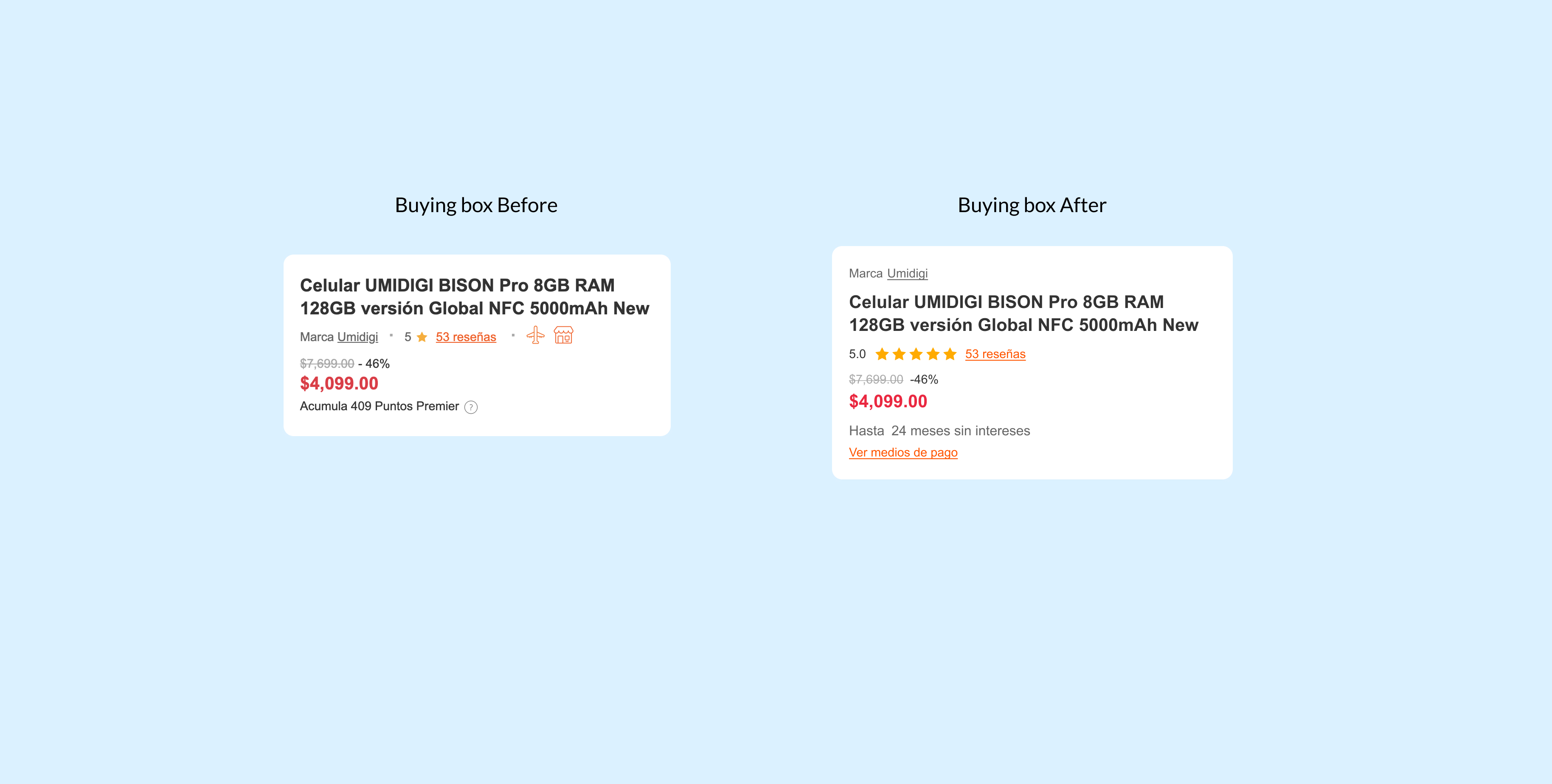
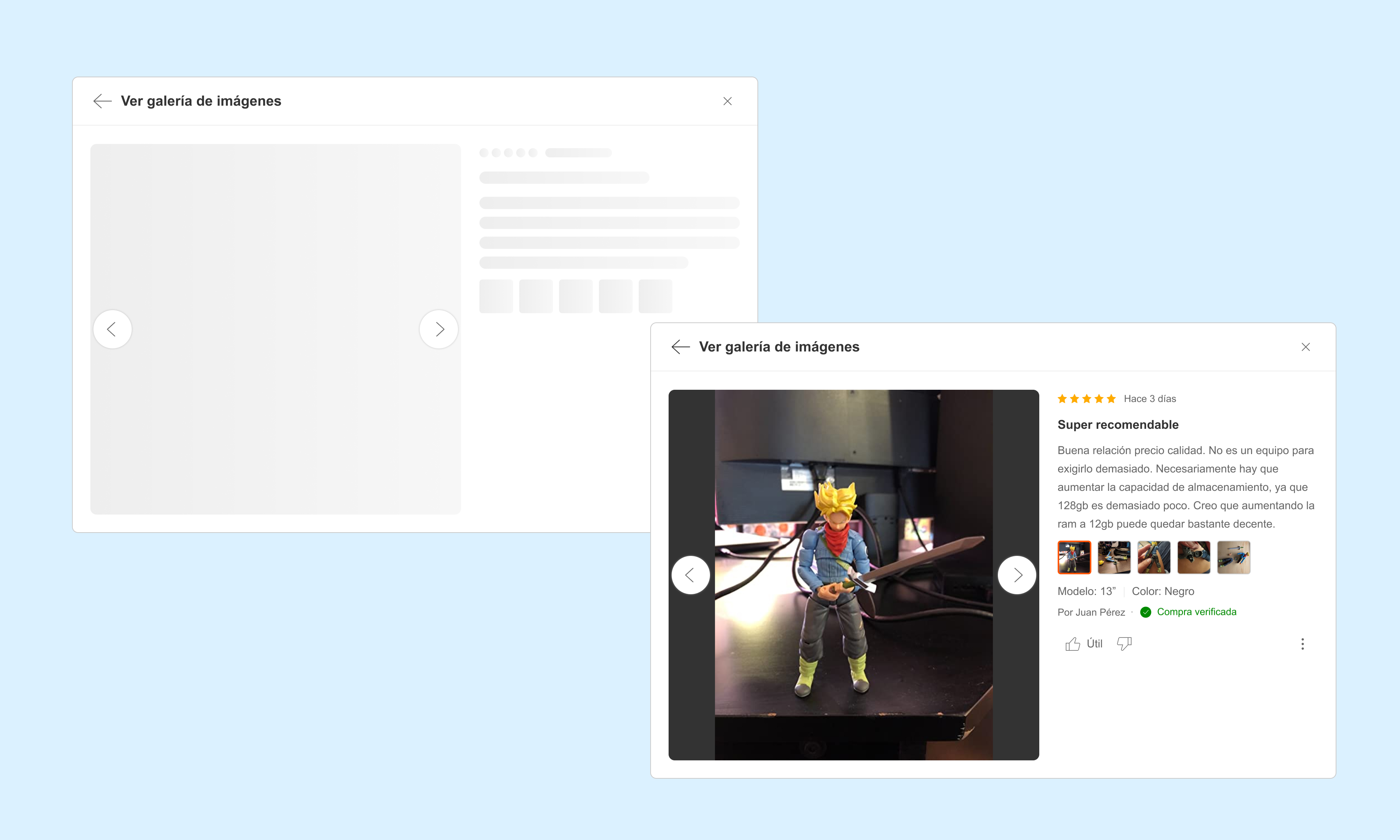
- Move the reviews section closer to the initial visible area of the PDP.
- Create clear filters (most recent, top rated, with photos, by product features).
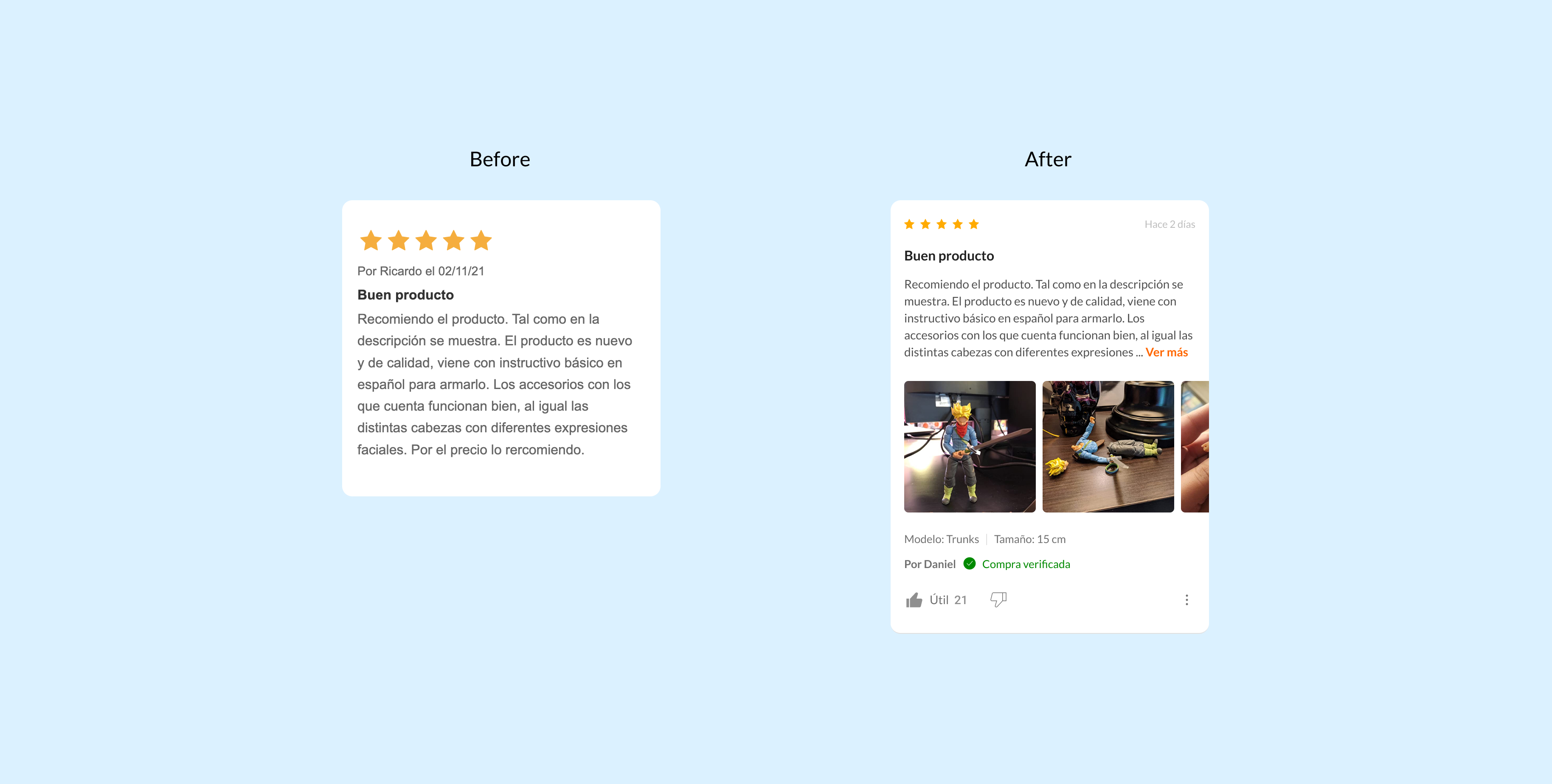
- Include visual trust tags (e.g., “Verified purchase”).
- Highlight reviews with specific usage context.
Design
With the opportunities defined, the team translated insights into wireframes and interactive prototypes
We iterated through usability testing, refining the experience to ensure reviews were easier to find, more trustworthy, and seamlessly integrated into the PDP.
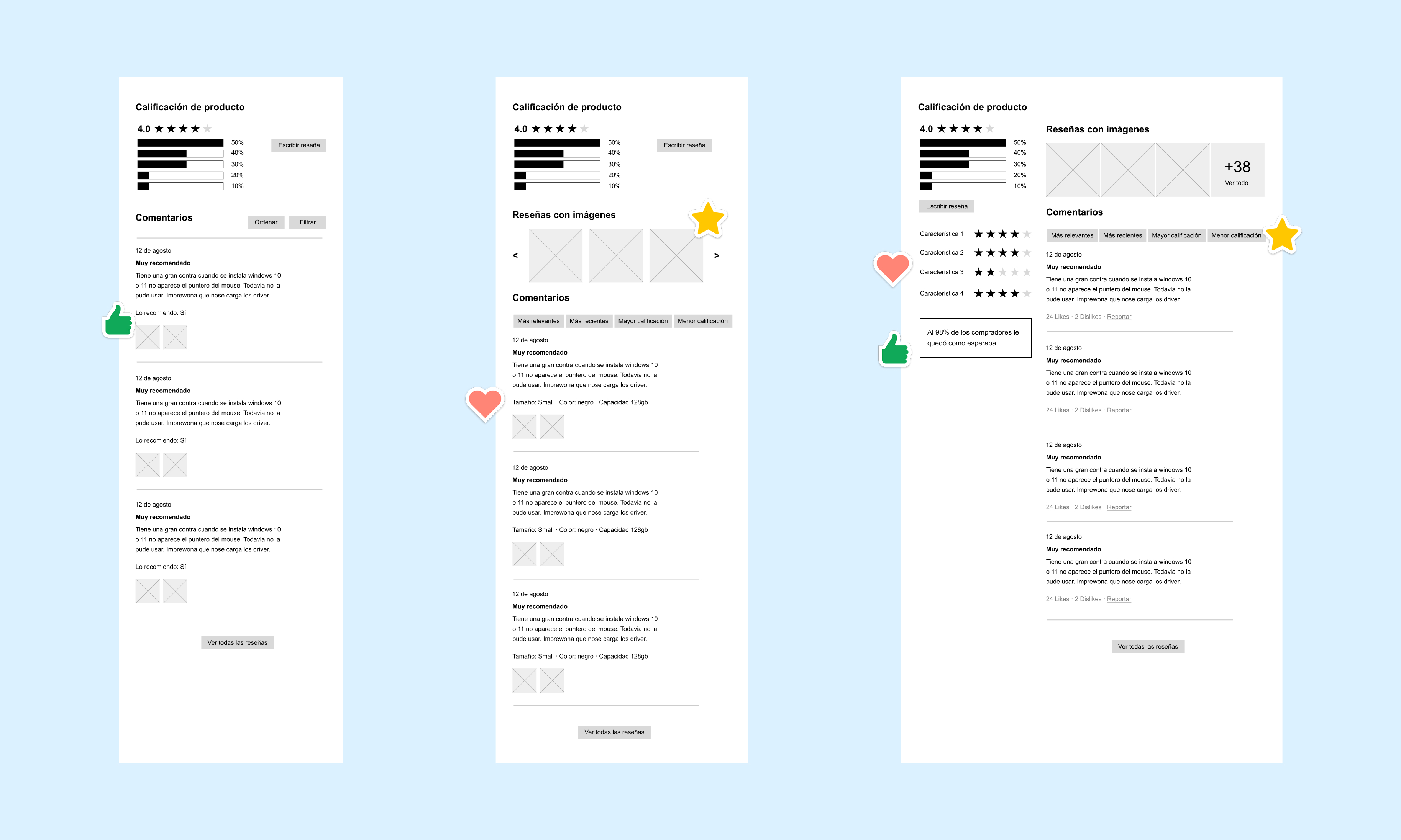
- Wireframes and interactive prototypes in Figma.
- Remote usability testing with 10 users in Chile and Mexico.
- Iterations to simplify filters and highlight the overall rating with stronger visual elements.
Implementation
Once the designs were validated, I coordinated closely with the development team to bring the new reviews experience to life
We focused on performance, accessibility, and seamless integration within the existing PDP framework to ensure a smooth rollout across markets.
- Coordination with development to ensure performance and lazy loading of images.
- Accessibility QA (contrast, semantic tagging for screen readers).
Outcomes
The redesign of the reviews section generated meaningful improvements for both users and the business
By making reviews more visible, trustworthy, and easier to navigate, we boosted engagement while strengthening user confidence and driving higher conversions across key categories.
+45%
Interaction with the reviews section.
+23%
Conversion rate in key categories.
+37%
Average time spent reading reviews.
Key learnings
- — Strategic content placement in the PDP can directly impact conversion rates.
- — Trust is built not just through the number of reviews but through visual quality and relevant context.
- — An iterative process combining quantitative and qualitative data delivers optimizations beyond a simple visual redesign.
Let’s create great experiences together!
Whether you want to discuss a project, collaborate, or just connect, feel free to reach out.